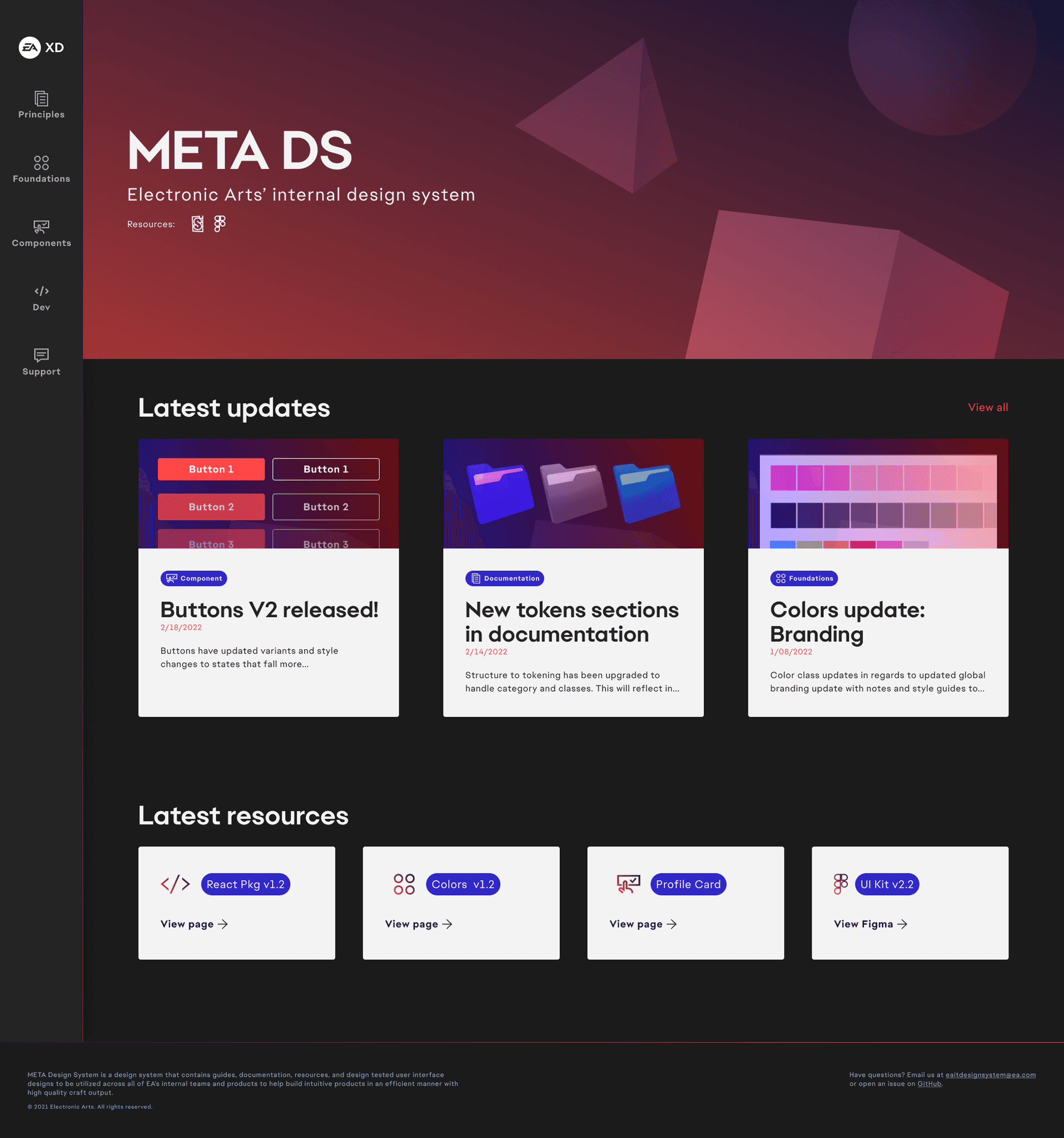
META Design System
META Design System
META Design System
"Creating solutions for a suite of teams & products"
"Creating solutions for a suite of teams & products"
"Creating solutions for a suite of teams & products"

Role
Sr Manager/Lead UX Design
Timeline
8 months
Platform
Web/Mobile Responsive
Teams
4 Design, 2 Research, Eng, Dev Agency


XD
Principles
Foundations
Components
Dev
Support
Accordion
Avatar
Badges
Breadcrumb
Buttons
Cards
Checkbox
Date Picker
Empty State
Footer
Hero Section
Hyperlinks
Lists
Modals
Nav Bar
Pagination
Progress Bar
Radio Button
Search
Selector
Components
Foundational UI that can be utilized to create different interfaces, products, and features.

Sort by: Alphabetical
Resources:
Benefits application
Expense report application
2022 expenses can be filed by form using the link below.
Open form
Section 3
Accordion
Multi-panel containers that can expand and collapse providing detailed info and actions for...

Avatar
Fixed image that represents user profiles and can store store menus and show status throug...
Badge
Notification iconography used to illustrate attention to an event or state that hasn’t been...
Breadcrumb 1
/
Current Page
Breadcrumb
Multi link line that enables users to interact with each section to navigate through nested conte...
Buttons
Button
Main form of interaction UI that prompts users to interact in order to execute actions and rec...

FIFA 2022™
Purchase your copy today!
Buy now
Card
Cards utilize multiple content and actions to promote actions, information, or redirect users...
Account details
Remember on this device.
Checkbox
Inputs that can toggle verification of choice, both singular and multiple, as well as optional a...
EUrope (22)
United States (120)
LATAM (120)
Chips
UI that display meta information that can represent content being displayed at different...
Mon, Nov 17
November 2021
S
M
T
W
T
F
S
1
2
3
4
5
6
7
8
9
10
11
12
13
14
15
16
17
18
19
20
21
22
23
24
25
26
27
28
29
30
31
Cancel
Ok
Date Picker
Calendar that allows choice for month, day, and year. Additionally can provide choice of range f...
No software to view
Add new app
Empty State
States that replace content if there is none available to view that can also house actions...
Full Name
ex: Jane L Doe
Input
General input for alphanumeric values used in forms and data submission/verification that c...
Task 1
Task 2
Task 3
Task 4
List
Ordered and unordered list treatments that also utilize iconography subcomponents to support...
1
2
3
Page:
10
Pagination
Content navigation commonly used for multiple sub page views with articles, information, and...
Patching...
100%
Progress Bar
Indicator that can be used for loading, updating, or any visibility on data progress that is curren...
Option 1
Option 2
Option 3
Option 4
Radio Button
Single choice buttons for selecting one option out of 2 or more when there is a strict boolea...
Find your answer
Go
Search
Primary input used that handles core UI behavior and states on search, indexing, prepo...
Choose an option
Selector
Input that utilizes pre-populated menu of choices to select, and allows for multi-select w...
Volume
100
Slider
Adjuster that allows users to input values or interact with knob to set values to their desir...
Details
Review
Stepper
Utilized to provide context with icons and text for where the user is in a flow specified with d...
Switch
Toggle to enable on and off states for specific settings or controls. Commonly found in the se...
Label 1
Label 1
Label 1
Tab Nav
Secondary navigation used for nested content within pages that allow simple user choice and...
ID
NAME
LOCATION
VENDOR
MODEL
31301
XBOXONE
Bucharest
Microsoft
XboxOne
31301
XBOXONE
Bucharest
Microsoft
XboxOne
31301
XBOXONE
Bucharest
Microsoft
XboxOne
31301
XBOXONE
Bucharest
Microsoft
XboxOne
31301
XBOXONE
Bucharest
Microsoft
XboxOne
31301
XBOXONE
Bucharest
Microsoft
XboxOne
31301
XBOXONE
Bucharest
Microsoft
XboxOne
31301
XBOXONE
Bucharest
Microsoft
XboxOne
31301
XBOXONE
Bucharest
Microsoft
XboxOne
Tables
Complex components that allow addition of rows, columns, cells, and different UI interactio...
Bio
Default Prefix
Text Area
Inputs that allow multi line inputs with or without restriction used in forms and profiles t...
Update completed!
Patch 1.2.1 has been fully updated.
Toast
Basic toast for general communication across applications that can be closed or dismissed a...
First step begins here
Tooltip
Manual and automatic forms of surfacing indicators to drive users to core actions or ste...
META Design System is a design system that contains guides, documentation, resources, and design tested user interface designs to be utilized across all of EA’s internal teams and products to help build intuitive products in an efficient manner with high quality craft output.
Have questions? Email us at eaitdesignsystem@ea.com
or open an issue on GitHub.
© 2021 Electronic Arts. All rights reserved.
XD
Principles
Foundations
Components
Dev
Support
Accordion
Avatar
Badges
Breadcrumb
Buttons
Cards
Checkbox
Date Picker
Empty State
Footer
Hero Section
Hyperlinks
Lists
Modals
Nav Bar
Pagination
Progress Bar
Radio Button
Search
Selector
Components
Foundational UI that can be utilized to create different interfaces, products, and features.
Sort by: Alphabetical
Resources:
Benefits application
Expense report application
2022 expenses can be filed by form using the link below.
Open form
Section 3
Accordion
Multi-panel containers that can expand and collapse providing detailed info and actions for...
Avatar
Fixed image that represents user profiles and can store store menus and show status throug...
Badge
Notification iconography used to illustrate attention to an event or state that hasn’t been...
Breadcrumb 1
/
Current Page
Breadcrumb
Multi link line that enables users to interact with each section to navigate through nested conte...
Buttons
Button
Main form of interaction UI that prompts users to interact in order to execute actions and rec...
FIFA 2022™
Purchase your copy today!
Buy now
Card
Cards utilize multiple content and actions to promote actions, information, or redirect users...
Account details
Remember on this device.
Checkbox
Inputs that can toggle verification of choice, both singular and multiple, as well as optional a...
EUrope (22)
United States (120)
LATAM (120)
Chips
UI that display meta information that can represent content being displayed at different...
Mon, Nov 17
November 2021
S
M
T
W
T
F
S
1
2
3
4
5
6
7
8
9
10
11
12
13
14
15
16
17
18
19
20
21
22
23
24
25
26
27
28
29
30
31
Cancel
Ok
Date Picker
Calendar that allows choice for month, day, and year. Additionally can provide choice of range f...
No software to view
Add new app
Empty State
States that replace content if there is none available to view that can also house actions...
Full Name
ex: Jane L Doe
Input
General input for alphanumeric values used in forms and data submission/verification that c...
Task 1
Task 2
Task 3
Task 4
List
Ordered and unordered list treatments that also utilize iconography subcomponents to support...
1
2
3
Page:
10
Pagination
Content navigation commonly used for multiple sub page views with articles, information, and...
Patching...
100%
Progress Bar
Indicator that can be used for loading, updating, or any visibility on data progress that is curren...
Option 1
Option 2
Option 3
Option 4
Radio Button
Single choice buttons for selecting one option out of 2 or more when there is a strict boolea...
Find your answer
Go
Search
Primary input used that handles core UI behavior and states on search, indexing, prepo...
Choose an option
Selector
Input that utilizes pre-populated menu of choices to select, and allows for multi-select w...
Volume
100
Slider
Adjuster that allows users to input values or interact with knob to set values to their desir...
Details
Review
Stepper
Utilized to provide context with icons and text for where the user is in a flow specified with d...
Switch
Toggle to enable on and off states for specific settings or controls. Commonly found in the se...
Label 1
Label 1
Label 1
Tab Nav
Secondary navigation used for nested content within pages that allow simple user choice and...
ID
NAME
LOCATION
VENDOR
MODEL
31301
XBOXONE
Bucharest
Microsoft
XboxOne
31301
XBOXONE
Bucharest
Microsoft
XboxOne
31301
XBOXONE
Bucharest
Microsoft
XboxOne
31301
XBOXONE
Bucharest
Microsoft
XboxOne
31301
XBOXONE
Bucharest
Microsoft
XboxOne
31301
XBOXONE
Bucharest
Microsoft
XboxOne
31301
XBOXONE
Bucharest
Microsoft
XboxOne
31301
XBOXONE
Bucharest
Microsoft
XboxOne
31301
XBOXONE
Bucharest
Microsoft
XboxOne
Tables
Complex components that allow addition of rows, columns, cells, and different UI interactio...
Bio
Default Prefix
Text Area
Inputs that allow multi line inputs with or without restriction used in forms and profiles t...
Update completed!
Patch 1.2.1 has been fully updated.
Toast
Basic toast for general communication across applications that can be closed or dismissed a...
First step begins here
Tooltip
Manual and automatic forms of surfacing indicators to drive users to core actions or ste...
META Design System is a design system that contains guides, documentation, resources, and design tested user interface designs to be utilized across all of EA’s internal teams and products to help build intuitive products in an efficient manner with high quality craft output.
Have questions? Email us at eaitdesignsystem@ea.com
or open an issue on GitHub.
© 2021 Electronic Arts. All rights reserved.
Problem & Opportunity
Problem & Opportunity
Design across a diverse ecosystem
Design across a diverse ecosystem
Design across a diverse ecosystem
EA’s isolated web products led to inconsistent UI, duplicated work, high costs, and delays. Our goal: build a sustainable system for efficiency, brand consistency, and accessibility without slowing innovation.
EA’s isolated web products led to inconsistent UI, duplicated work, high costs, and delays. Our goal: build a sustainable system for efficiency, brand consistency, and accessibility without slowing innovation.
Problems
Hundreds of products
No defined principles
No design system or kit
Designers in multi silos
Old branding in designs
Hand off to eng process
Goals
Create design principles
Create a design system
Designers work end to end
Create a dev friendly UI Kit
New processes with engineers
DS onboarding for teams
Discovery
36 stakeholder interviews, explore suite of products and teams
Design
Stand up React + Figma MVP; pilot with Creator’s Network
Support
QA, regressions, Figma analytics + Survey adoption feed & time‑saved KPIs
Experiment
Explore and draft color, type, grid, token schema, and team process and setup
Iterate
Review sessions, phased adoption; workshops, and live support
Process
Process
Ensuring a path forward
Ensuring a path forward
Ensuring a path forward
Early steps jumping on to create proof of concept component lists, foundations, and process between design and engineering allowed to streamline processes that tested out positive with team members who were able to contribute to building out components and mock applying them in staged environments.
Early steps jumping on to create proof of concept component lists, foundations, and process between design and engineering allowed to streamline processes that tested out positive with team members who were able to contribute to building out components and mock applying them in staged environments.
Role
As a manager
As a manager
As a manager
By undertaking this from the ground up as a new idea to gain approval it required hands on work, but plans to roadmap, advocate, win investment, build & budget teams, and proving it out while people managing team members.
By undertaking this from the ground up as a new idea to gain approval it required hands on work, but plans to roadmap, advocate, win investment, build & budget teams, and proving it out while people managing team members.
Build a team 0-1
Input: Need resourcing as solo designer can't scale/sustain
Decision: Gained team support and budget for 1 contractor
Impact: Ability to build out a deeper foundation more timely
Plan, pitch, and execute
Input: Without sponsor investment this can't scale
Decision: Presented vision, goal, demo at CTO all hands
Impact: Officially approved as a budget backed initiative
Governance & adoption
Input: No dev library to be open source for teams
Decision: Work with dev agency to build pipeline & pkg
Impact: Package accessible for any dev to utilize
Manage moving forward
Input: Need a process and structure to keep building
Decision: Weekly reviews, workshops, QA sessions
Impact: Onboarded 2+ designers and had quarterly goals
Role
As a designer & lead
As a designer & lead
As a designer & lead
Built core foundations and 20+ components to prove the system’s value, connecting Figma API to Storybook with early engineering collaboration.
Built core foundations and 20+ components to prove the system’s value, connecting Figma API to Storybook with early engineering collaboration.
Research
Research
Understanding team needs
Understanding team needs
Understanding team needs
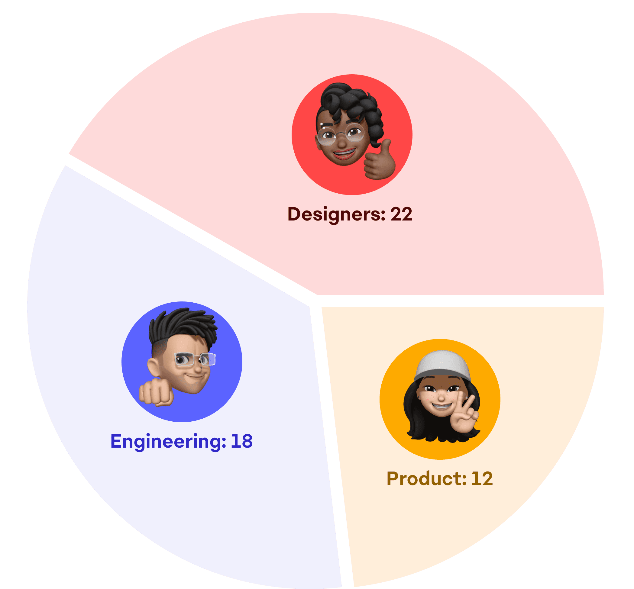
Spoke with teams across enterprise, B2B, and B2C, giving users space to share role specific insights. Synthesized findings into clear, actionable solutions. Managed employees afterwards to follow similar approaches when tackling tasks around foundations, components, and documentation.
Spoke with teams across enterprise, B2B, and B2C, giving users space to share role specific insights. Synthesized findings into clear, actionable solutions. Managed employees afterwards to follow similar approaches when tackling tasks around foundations, components, and documentation.

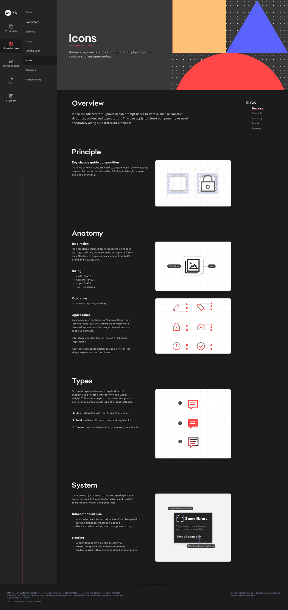
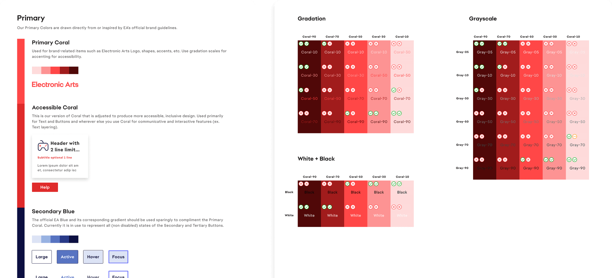
Foundations
Foundations
Start with the basics
Start with the basics
Start with the basics
Integrated new EA branding with scalable color gradations, updated type scale, improved 3:1 accessibility standards, responsive spacing/grids, and tokenization to ensure consistency, cross-product design and different teams.
Integrated new EA branding with scalable color gradations, updated type scale, improved 3:1 accessibility standards, responsive spacing/grids, and tokenization to ensure consistency, cross-product design and different teams.

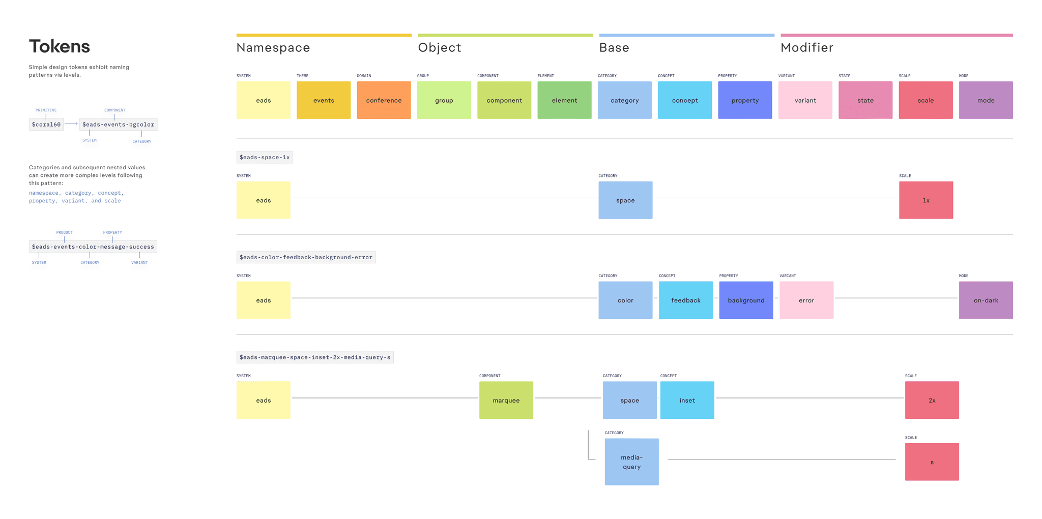
Tokenization
Tokenization
System built to be modular
System built to be modular
System built to be modular
Designed and implemented a token‑driven Figma ➜ React pipeline designing 40+ reusable components, cutting average front-end dev time on new projects by 30 %.
Designed and implemented a token‑driven Figma ➜ React pipeline designing 40+ reusable components, cutting average front-end dev time on new projects by 30 %.
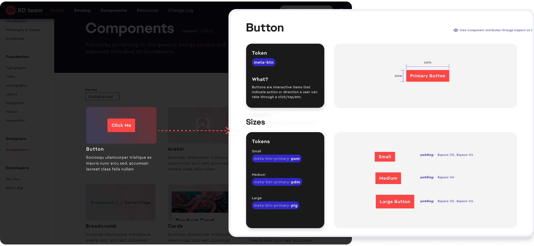
Documentation
Documentation
Design with intent & reason
Design with intent & reason
Design with intent & reason
Enabled teams and held design accountable for how and why components, primitives, and any design system element is created. Ensuring confidence in reasoning and allowing for conversation to ideate, and collaborate on further improvements/adaptations.
Enabled teams and held design accountable for how and why components, primitives, and any design system element is created. Ensuring confidence in reasoning and allowing for conversation to ideate, and collaborate on further improvements/adaptations.


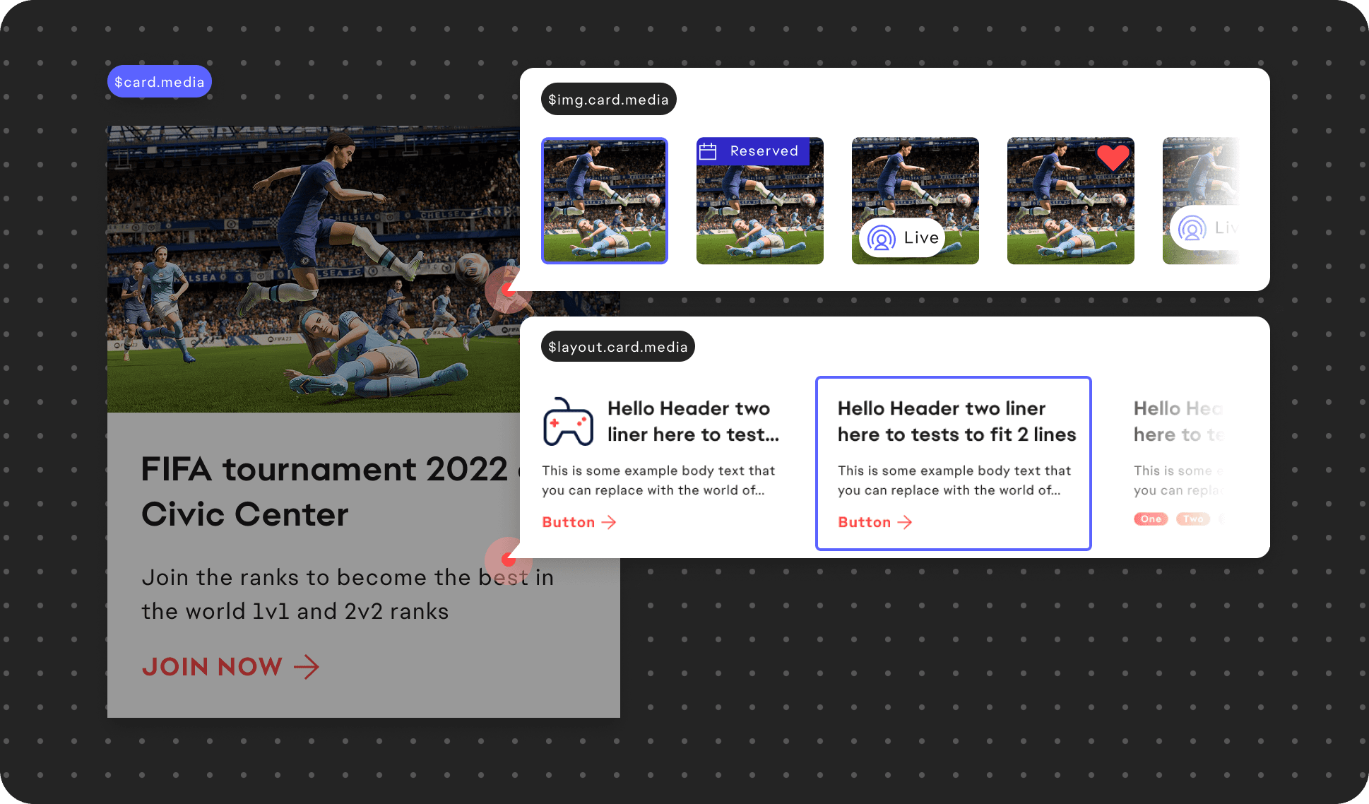
Components
Components
Modular for growth
Modular for growth
Modular for growth
Built high‑stakes patterns—adaptive data tables, multi‑step forms, dynamic modals—partnering with engineers to keep Storybook and production 100 % in‑sync.
Built high‑stakes patterns—adaptive data tables, multi‑step forms, dynamic modals—partnering with engineers to keep Storybook and production 100 % in‑sync.
Branding & Website
Branding & Website
Centralized access
Centralized access
Centralized access
Ensured teams had access to relevant design and dev resources for individuals to grab what was needed or review guidelines to ensure proper adoption at any scale. Additionally this helped tie branding and stakeholder buy in through a more professional way to present design system work and resources to a wider audience.
Ensured teams had access to relevant design and dev resources for individuals to grab what was needed or review guidelines to ensure proper adoption at any scale. Additionally this helped tie branding and stakeholder buy in through a more professional way to present design system work and resources to a wider audience.

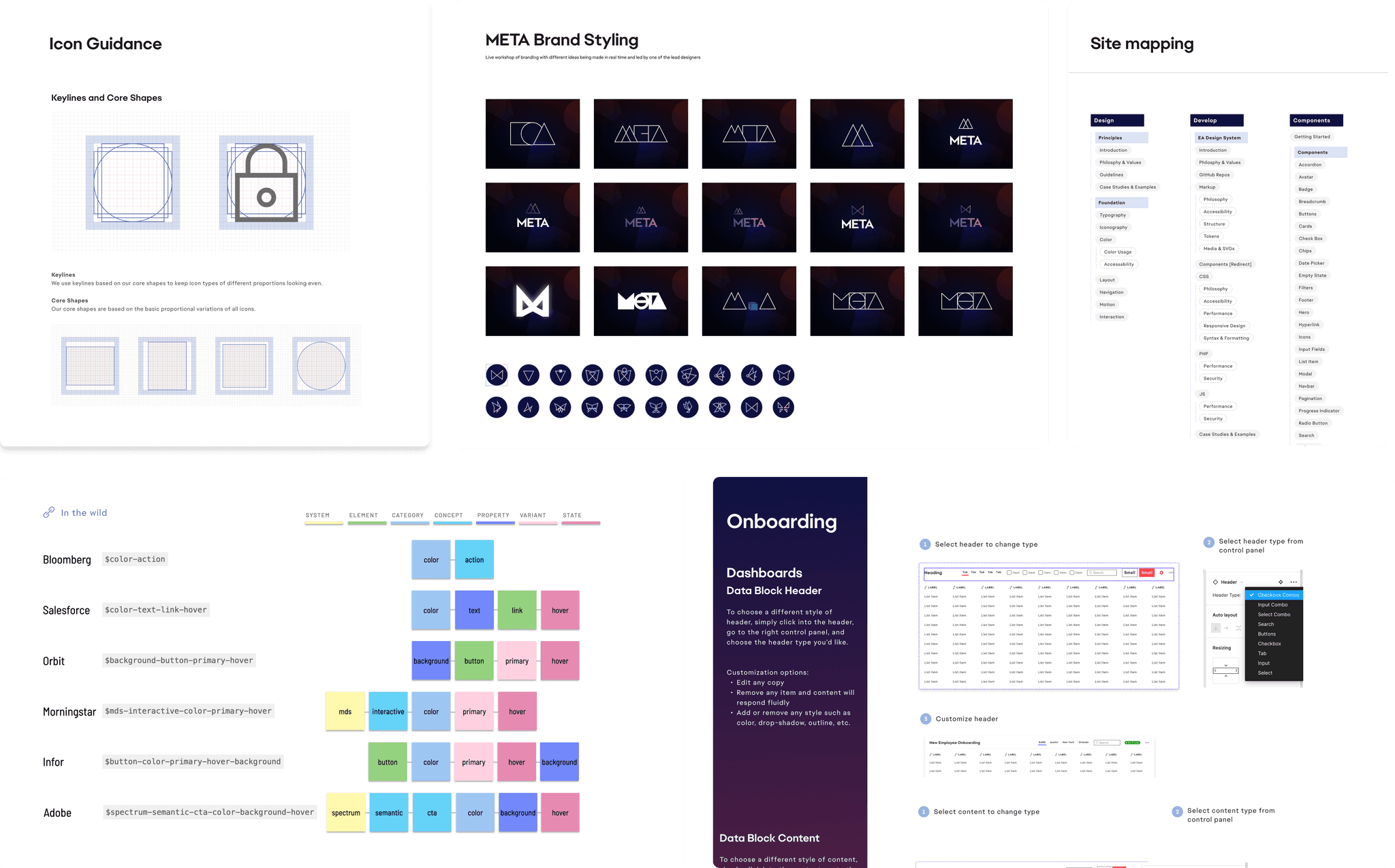
Accessibility
Accessibility
Pioneering inclusive design
Pioneering inclusive design
Pioneering inclusive design
Collaborated with a designer and researcher to deliver WCAG 2.1 AA compliance enabling first time successful baseline standards to be applied for contrast, text, and image combinations.
Collaborated with a designer and researcher to deliver WCAG 2.1 AA compliance enabling first time successful baseline standards to be applied for contrast, text, and image combinations.
Processes
Processes
Collaboration across teams
Collaboration across teams
Collaboration across teams
Ran weekly design‑system critiques and live pairing sessions, up‑skilling junior designers. This led to discovery and further progress on foundations, website, processes, and component building by embedding designers and myself within other team initiatives.
Ran weekly design‑system critiques and live pairing sessions, up‑skilling junior designers. This led to discovery and further progress on foundations, website, processes, and component building by embedding designers and myself within other team initiatives.
Application
Application
Several areas of adoption
Several areas of adoption
Several areas of adoption
There were many product initiatives scaling from small to large that started the adoption for branding, consistency, ease of use, and other purposes. But overall landed great representation and proof of success through 5 larger sites and products.
There were many product initiatives scaling from small to large that started the adoption for branding, consistency, ease of use, and other purposes. But overall landed great representation and proof of success through 5 larger sites and products.

Results
Results
Big impact & bigger aspirations
Big impact & bigger aspirations
Big impact & bigger aspirations
As the first design-wide approved initiative, it enabled teams to work faster, at scale, and with higher quality—marking a level of impact the CTO org had never seen in design.
As the first design-wide approved initiative, it enabled teams to work faster, at scale, and with higher quality—marking a level of impact the CTO org had never seen in design.
5
5
5
Core EA products
adopted META utilizing it across web experiences
adopted META utilizing it across web experiences
25%
25%
25%
↓ design time
on avg across products utilizing META
on avg across products utilizing META
48%
48%
↓ front-end
dev times across teams that adopted META
dev times across teams that adopted META
1st
1st
1st
design approval
CTO wide objective not relating to only feature work
CTO wide objective not relating to only feature work
90%
90%
90%
team approval
after surveying dev, product, and design teams
after surveying dev, product, and design teams
Learnings
Learnings
Reflect and look at the future
Reflect and look at the future
Reflect and look at the future
Openness to collaboration drove strong adoption, while ongoing and new initiatives kept us future-focused, scalable, and essential to every team’s success.
Openness to collaboration drove strong adoption, while ongoing and new initiatives kept us future-focused, scalable, and essential to every team’s success.
Design systems require investment
Learning more about the upfront investment beyond just the design side helped understand what to execute on and why with less ambiguity and risk.
Incorporate more external teams
Next would be bringing in more teams that can utilize the DS and ensure growth, but also infuse more feedback, ideas, and improvements for it.
Streamline design to development
Experimenting with Figma API and Storybook is a current process that is being tested and look forward to making it a permanent part of the DS building process.
Stay up to date on software use
Figma will be introducing new variant prototyping and variable functionality. We planned to stay on top of utilizing the latest tools without halting progress.