IMVU: Redesign & Design System
"Bring clarity, relevance, and modern craft — one flow at a time."
"Bring clarity, relevance, and modern craft — one flow at a time."

Role
Director, Product Design
Timeline
1 year
Platform
iOS, Android, Web
Teams
3 Designers, Engineering
Product, Marketing


OVERVIEW
Finding Opportunities
Finding Opportunities
IMVU’s core experience hadn’t evolved in over a decade despite a loyal community and strong UGC. Facing declining engagement and monetization, I led a redesign to modernize the platform, improve new user acquisition and retention, and streamline design delivery.
Problems
Dated design foundation
No defined principles
Design siloed by platform
Had UI Kits but no system
2 foundations defined
Eng owning UI edge cases
Goals
Modernize design language
Create principles
Design works cross-platform
1 UI kit to manage at least 85%
Define 6 foundations
Design owns UI edge cases
OVERVIEW
Finding Opportunities
IMVU’s core experience hadn’t evolved in over a decade despite a loyal community and strong UGC. Facing declining engagement and monetization, I led a redesign to modernize the platform, improve new user acquisition and retention, and streamline design delivery.
Problems
Dated design foundation
No defined principles
Design siloed by platform
Had UI Kits but no system
2 foundations defined
Eng owning UI edge cases
Goals
Modernize design language
Create principles
Design works cross-platform
1 UI kit to manage at least 85%
Define 6 foundations
Design owns UI edge cases
Planning in parallel
Input: Pitch parallel design system and features launch strategy
Decision: Move forward with pre-phase design system progress
Impact: Aligned with eng, product, and design on timelines

Empowering designers
Input: Design systems were never utilized or explored by teams
Decision: Grow designers to build components & foundations
Impact: Speed up progress, and onboarding for use in pods


Design ownership on UI tech
Input: Engineering provided input on design owning UI behavior
Decision: Mentor design to execute documentation, tokens, etc
Impact: Engineering had cohesive design guide across platforms
Exercise together with PODs
Input: Create foundations & 20+ components set in new features
Decision: Aligned engineering to scope & support across teams
Impact: Scope increased by 10% but did not delay release plans
Planning in parallel
Input: Pitch parallel design system and features launch strategy
Decision: Move forward with pre-phase design system progress
Impact: Aligned with eng, product, and design on timelines
Empowering designers
Input: Design systems were never utilized or explored by teams
Decision: Grow designers to build components & foundations
Impact: Speed up progress, and onboarding for use in pods
Design ownership on UI tech
Input: Engineering provided input on design owning UI behavior
Decision: Mentor design to execute documentation, tokens, etc
Impact: Engineering had cohesive design guide across platforms
Exercise together with PODs
Input: Create foundations & 20+ components set in new features
Decision: Aligned engineering to scope & support across teams
Impact: Scope increased by 10% but did not delay release plans
ROLE
Creating Foundation
Creating Foundation
Balancing IC leadership and mentoring was challenging—especially with no budget and ongoing features. I built from the ground up, auditing UI artifacts and staying flexible to align with XFN partners before engineering handoff.
Balancing IC leadership and mentoring was challenging—especially with no budget and ongoing features. I built from the ground up, auditing UI artifacts and staying flexible to align with XFN partners before engineering handoff.
EXPLORATION & PLANNING
Impossible to Possible
Impossible to Possible
Started system foundations early, sharing proposals to guide direction. Aligned with engineering on phased releases to ship incrementally and build for reuse.
Mo 1
Mo 2
Mo 3
Mo 4
Mo 5
Mo 6
Mo 7
Mo 8
Discovery
Research
Requirements
Component needs
Start design
Initial Builds
QA & reviews
Tests
Dev QA
Start releases
Final releases
Further testing
FEATURES TRACK
Discovery
Draft:
• Foundations
• Components
• Documentation
Build foundations
Build components
Design<>Eng audits
Design reviews
QA & reviews
Iterations
Pivots
Build next phase components
DESIGN SYSTEM
DESIGN SYSTEM
Foundation for our
Product & Teams
Foundation for our
Product & Teams
Start a system with core components built for scale and reuse, set a foundation that supports modern UI needs and align with future product and engineering work.
PRINCIPLES
Quality, Growth, Intent
Quality, Growth, Intent
Set baselines to guide design toward scale, modernization, and craft. This served as a north star for all system decisions.
Set baselines to guide design toward scale, modernization, and craft. This served as a north star for all system decisions.
Mochim025
2h

11.4k

232
98
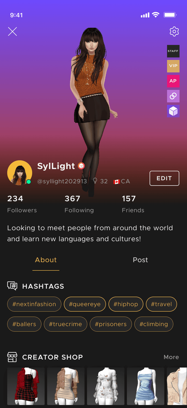
Components following for scale, quality, and delight, but also applied based on use case.
3 LIKES · 5 comments
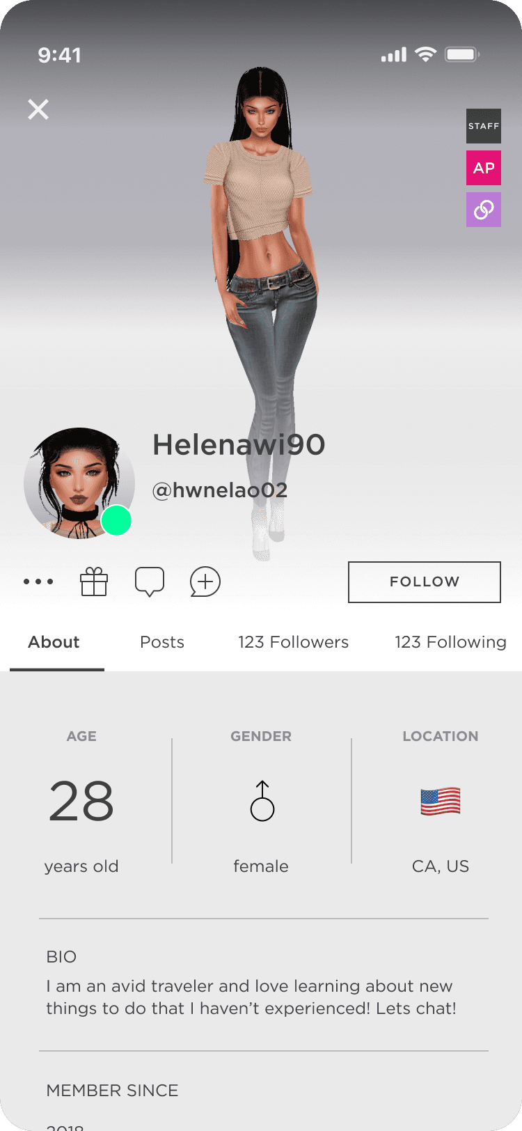
Older components didn't follow rules, weren't built for scale, static, and didn't have reasoning for system treatment creating disconnect across the app.
2h
Mochim025
Mochim025
2h
11.4k
232
98
Components following for scale, quality, and delight, but also applied based on use case.
3 LIKES · 5 comments
Older components didn't follow rules, weren't built for scale, static, and didn't have reasoning for system treatment creating disconnect across the app.
2h
Mochim025
SPACING
Scaling for Structure
Scaling for Structure
Tokenized structure that permitted reuse across components, layouts, and grids to create consistency and variety.
Tokenized structure that permitted reuse across components, layouts, and grids to create consistency and variety.
space30
list.pad.lg
list.gap.lg
list.mar.large
NaviTheFairy
sent you a friend request
space30
list.pad.lg
list.gap.lg
list.mar.large
NaviTheFairy
sent you a friend request
space30
list.pad.lg
list.gap.lg
list.mar.large
NaviTheFairy
sent you a friend request
space30
list.pad.lg
list.gap.lg
list.mar.large
NaviTheFairy
sent you a friend request
COLOR
Systematize Colors
Systematize Colors
Color tokens link primitives to components, supporting a new brand look while keeping key colors for context. This unified theme also improved accessibility.
Colors were just created more for branding preference. There was no structure of variable/tokenization for use or accessibility. I set a gold for at least being AA minimally for our launch.
Color tokens link primitives to components, supporting a new brand look while keeping key colors for context. This unified theme also improved accessibility.
⭐️ PRIMITIVE
elevation200
#F2F2F2
⚙️ listItem - icon
listItem.default.icon.color
⚙️ listItem - text
listItem.default.text.color

Lolacola928
Add friend
Follow
Send message
Send Gift
Report
cancel
⭐️ PRIMITIVE
elevation200
#F2F2F2
⚙️ listItem - icon
listItem.default.icon.color
⚙️ listItem - text
listItem.default.text.color
Lolacola928
Add friend
Follow
Send message
Send Gift
Report
cancel
⭐️ PRIMITIVE
elevation200
#F2F2F2
⚙️ listItem - icon
listItem.default.icon.color
⚙️ listItem - text
listItem.default.text.color
Lolacola928
Add friend
Follow
Send message
Send Gift
Report
cancel
⭐️ PRIMITIVE
elevation200
#F2F2F2
⚙️ listItem - icon
listItem.default.icon.color
⚙️ listItem - text
listItem.default.text.color
Lolacola928
Add friend
Follow
Send message
Send Gift
Report
cancel
TYPOGRAPHY
Hierarchy that Adapts
Hierarchy that Adapts
We introduced a ratio scale to support heavy, customizable UGC content across all platforms.
We introduced a ratio scale to support heavy, customizable UGC content across all platforms.
Display 1
Display 2
Display 3
Heading 1
Heading 2
Heading 3
Paragraph 1
Paragraph 2
Paragraph 3
44
36
32
24
20
16
14
12
CTA 1
CTA 2
CTA 3
Label 1
Label 2
Label 3
Caption 1
Caption 2
16
16
14
18
14
12
10
12
10
Typescale: Major Second
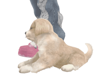
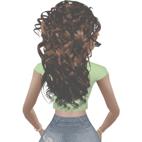
Tops
Bottoms
Hair
Accessories
DNA
NFTS
Tops
Boho button up
1000
Glam blazer
1999
Academia
900
Academia
850
For You
PETS
CURLY HAIR
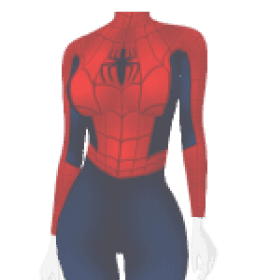
SPIDERMAN
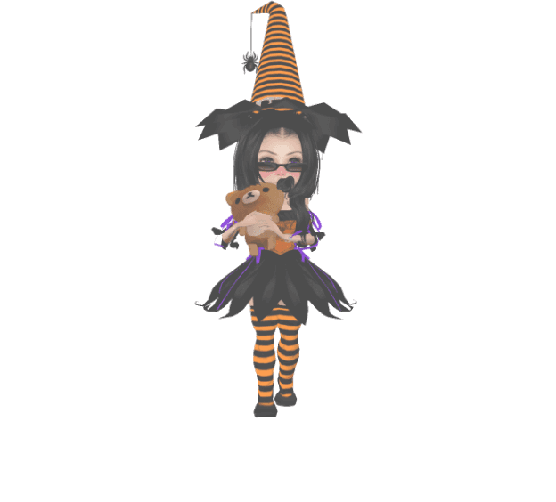
WITCHES
STREET
#ECLECTIC
#LONG CURLS
New
Explore Creators
CreatorName
@creatorName

CreatorName
@creatorName
CreatorName
@creatorName
2.5K
shop
Search
9:41
Display 1
Display 2
Display 3
Heading 1
Heading 2
Heading 3
Paragraph 1
Paragraph 2
Paragraph 3
44
36
32
24
20
16
14
12
CTA 1
CTA 2
CTA 3
Label 1
Label 2
Label 3
Caption 1
Caption 2
16
16
14
18
14
12
10
12
10
Typescale: Major Second
Tops
Bottoms
Hair
Accessories
DNA
NFTS
Tops
Boho button up
1000
Glam blazer
1999
Academia
900
Academia
850
For You
PETS
CURLY HAIR
SPIDERMAN
WITCHES
STREET
#ECLECTIC
#LONG CURLS
New
Explore Creators
CreatorName
@creatorName
CreatorName
@creatorName
CreatorName
@creatorName
2.5K
shop
Search
9:41
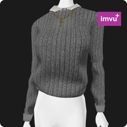
COMPONENTS
Modularity for Teams
Modularity for Teams
Components were documented and tokenized, with clear guidelines on interactions and edge cases to ensure easy reuse and updates.
Components were documented and tokenized, with clear guidelines on interactions and edge cases to ensure easy reuse and updates.
chatMsg
Build Ready
Primarily used for sent and received messages in Chat Rooms, DMs, and Chat Windows.
Composition
bubble
Chat Bubble
profileDisc.sm

Variants
chatMsg.sent
Message sent
chatMsg.sent.whisper
Whisper sent
chatMsg.receive
Received
chatMsg.receive.whisper
Whisper received
Guides
Text Fitting
Lorem ipsum dolor sit amet, consectetur adipiscing elit. Morbi lacus nisl, scelerisque non ultricies.
max-width: 90vw
max-height: 65vh
text-wrap: 90% width of chatBubble
Animation
motion.chatMsg.in
trigger: msgRecieve, msgSend
animation: .4s ease-in; /*motion.chatMsg.duration, motion.chatMsg.easing
translateY: -.3125rem; /*motion.chatMsg.translateY
opacity: 1;
anim.chatMsg.Out
animation: .4s ease-in;
translateY: -.3125rem;
opacity: 0;
/* startAnimation.event(exceedMsgCap) */
Custom mode
An empty frame that you can put anything inside of
Instructions:
Double Click this component, unlink the instance, and go to "Screen Content" in your assets panel.
Say something...
Send
Holiday Potluck
9:41
chatMsg
Build Ready
Primarily used for sent and received messages in Chat Rooms, DMs, and Chat Windows.
Composition
bubble
Chat Bubble
profileDisc.sm
Variants
chatMsg.sent
Message sent
chatMsg.sent.whisper
Whisper sent
chatMsg.receive
Received
chatMsg.receive.whisper
Whisper received
Guides
Text Fitting
Lorem ipsum dolor sit amet, consectetur adipiscing elit. Morbi lacus nisl, scelerisque non ultricies.
max-width: 90vw
max-height: 65vh
text-wrap: 90% width of chatBubble
Animation
motion.chatMsg.in
trigger: msgRecieve, msgSend
animation: .4s ease-in; /*motion.chatMsg.duration, motion.chatMsg.easing
translateY: -.3125rem; /*motion.chatMsg.translateY
opacity: 1;
anim.chatMsg.Out
animation: .4s ease-in;
translateY: -.3125rem;
opacity: 0;
/* startAnimation.event(exceedMsgCap) */
Custom mode
An empty frame that you can put anything inside of
Instructions:
Double Click this component, unlink the instance, and go to "Screen Content" in your assets panel.
Say something...
Send
Holiday Potluck
9:41
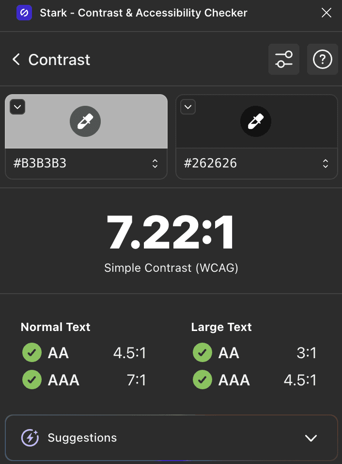
ACCESSIBILITY
Accessibility
Accessibility
We aimed for at least AA standards—and AAA when possible—on text, color, and images. Regular audits and updates helped us stay ahead in managing accessibility.
We aimed for at least AA standards—and AAA when possible—on text, color, and images. Regular audits and updates helped us stay ahead in managing accessibility.
OUTCOME
Design to Spark Initiative
Design to Spark Initiative
By Q1 2024, our core design library was live across platforms, supported by documentation, tokens, and updated Figma workflows. The design team also prepared briefs for future redesigns of key features beyond the year’s plan.
By Q1 2024, our core design library was live across platforms, supported by documentation, tokens, and updated Figma workflows. The design team also prepared briefs for future redesigns of key features beyond the year’s plan.
Before
After
Before
After
Before
After
Hashtags
First feature fully powered by the new design system, adopted across teams. Supported redesign of Chat Discovery, Profiles, and People Search, driving deeper engagement. Led to a new feature spec for interest-based hashtag selection.
Hashtags
First feature fully powered by the new design system, adopted across teams. Supported redesign of Chat Discovery, Profiles, and People Search, driving deeper engagement. Led to a new feature spec for interest-based hashtag selection.
Before
After
Before
After
Before
After
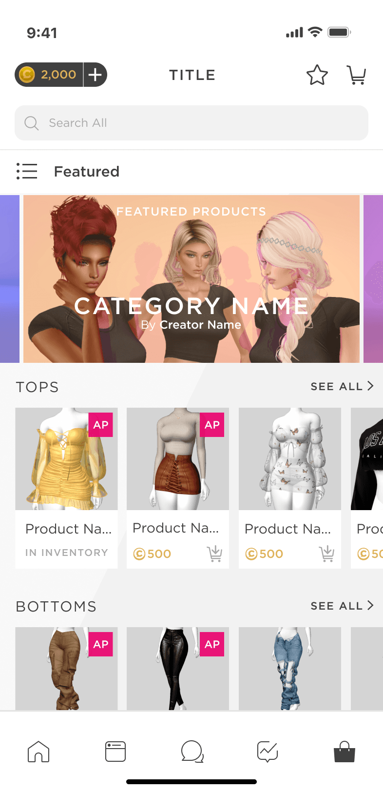
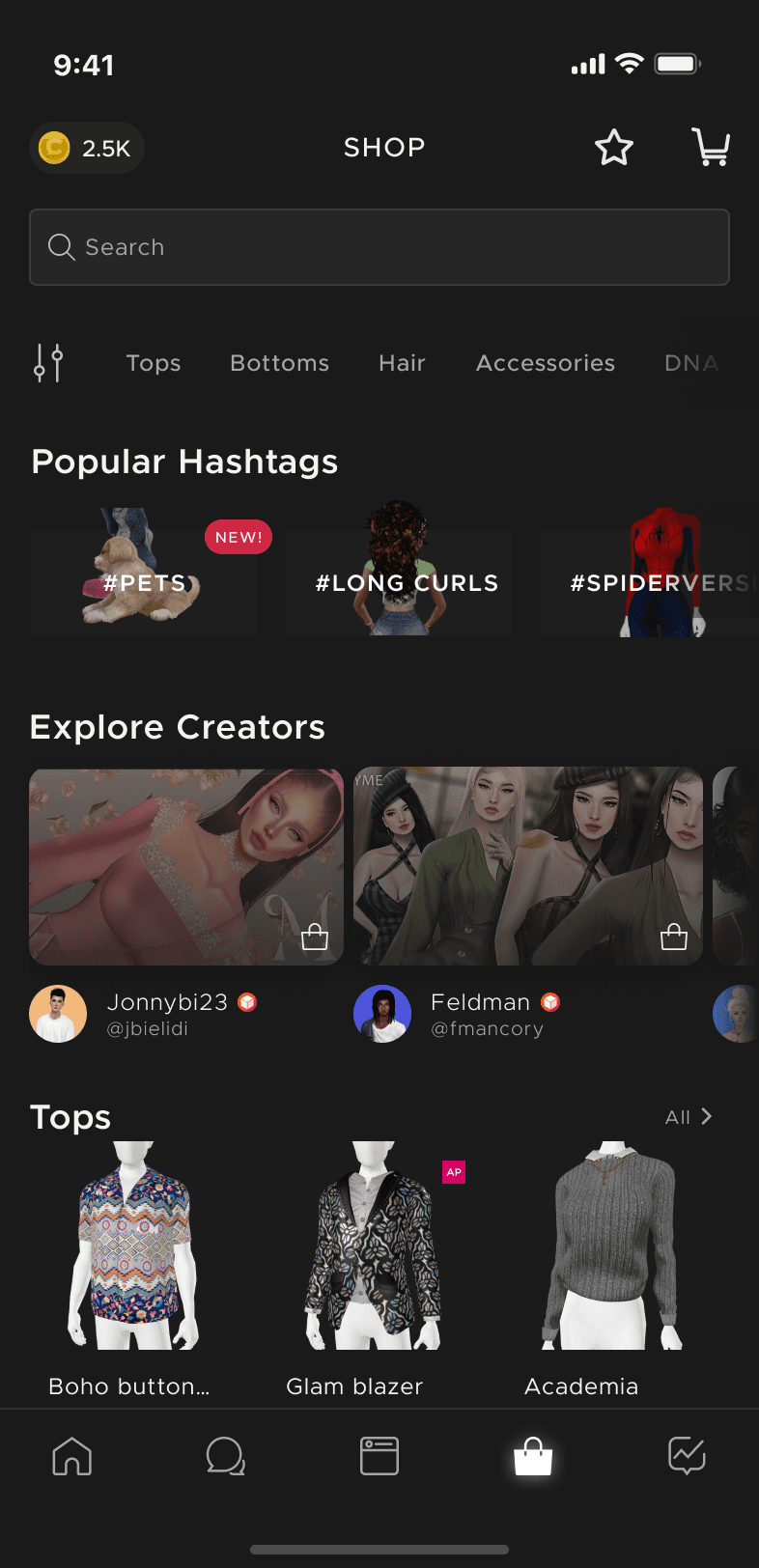
Shop
Improved the marketplace to balance showcasing featured content, personalizing by interests, and keeping focus on creators.
Shop
Improved the marketplace to balance showcasing featured content, personalizing by interests, and keeping focus on creators.
Before
After
Before
After
Before
After
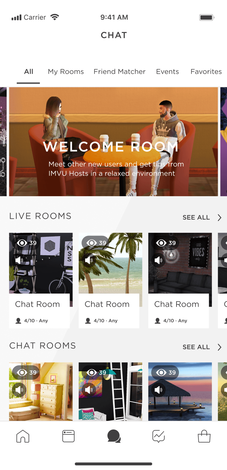
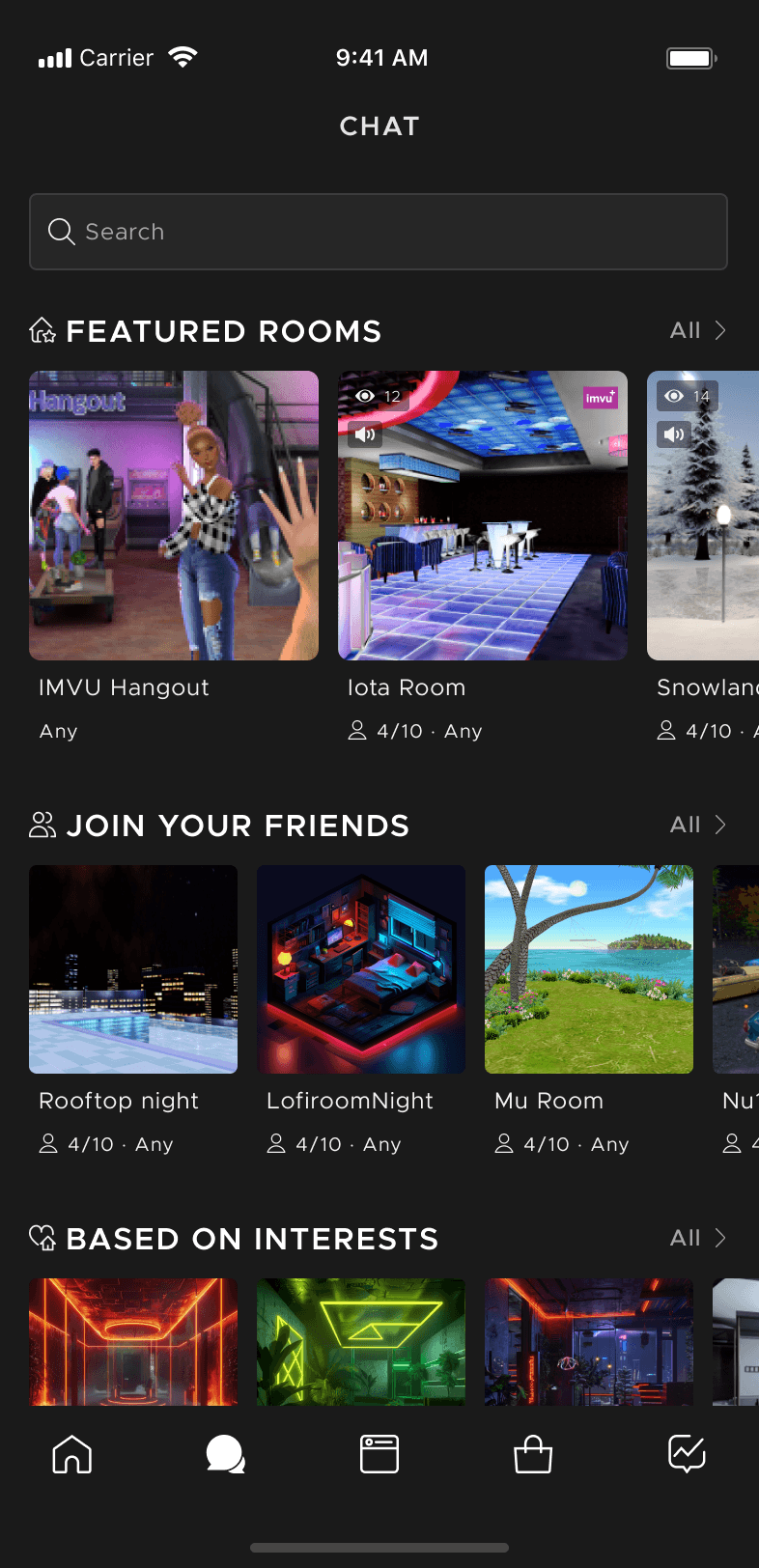
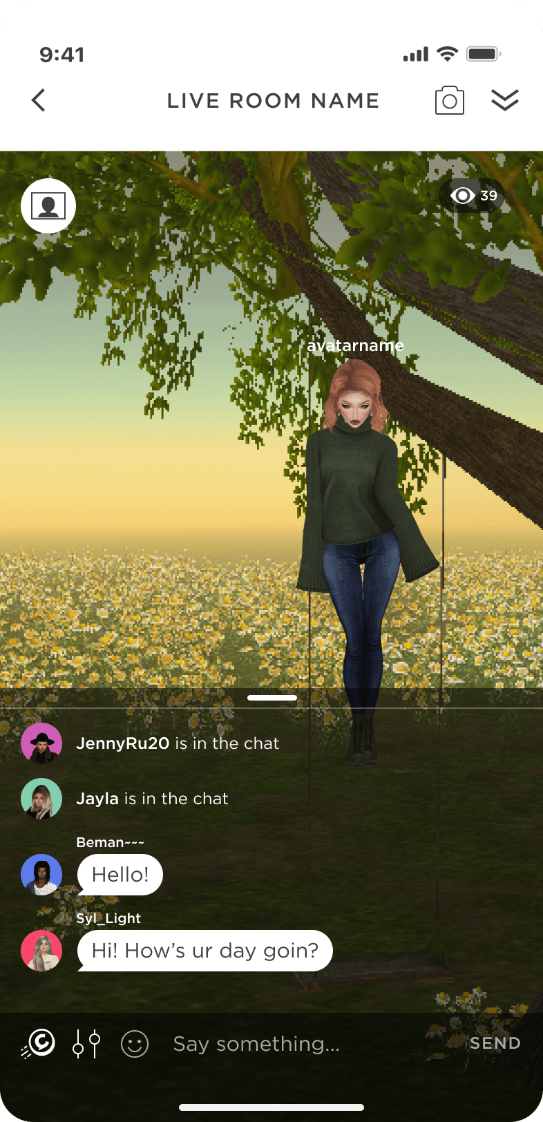
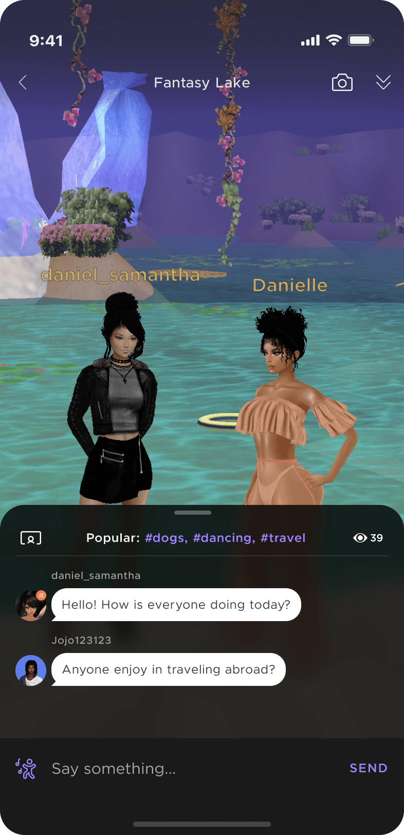
Chat Discovery
Boosted engagement in rooms and chat activity, especially for first-time users (55% retention if joined on Day 1). Enhanced discoverability with curated and personalized experiences, paving the way for hashtag integration.
Chat Discovery
Boosted engagement in rooms and chat activity, especially for first-time users (55% retention if joined on Day 1). Enhanced discoverability with curated and personalized experiences, paving the way for hashtag integration.
Before
After
Before
After
Before
After
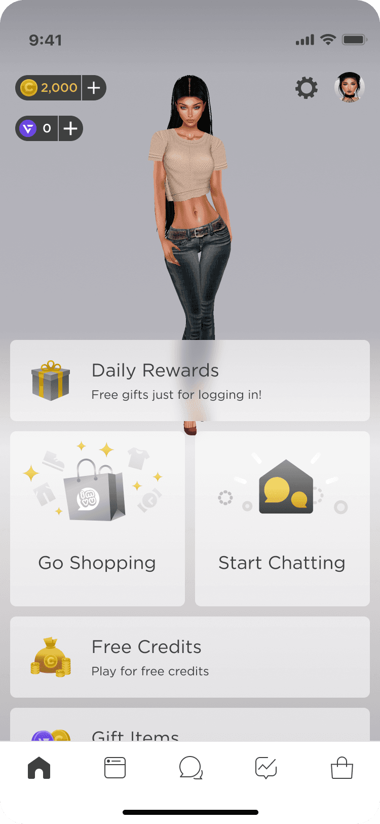
Dashboard (in-progress)
Reorganized navigation to surface core experiences and new features, reducing buried content, to improve funnel and engagement for monetization and discovery.
Before
After
Before
After
Before
After
Chat Rooms (In progress)
Prioritized content visibility while keeping key interaction tools accessible, preventing users from blocking the 3D social experience.
Chat Rooms (In progress)
Prioritized content visibility while keeping key interaction tools accessible, preventing users from blocking the 3D social experience.
Before
After
Before
After
Before
After
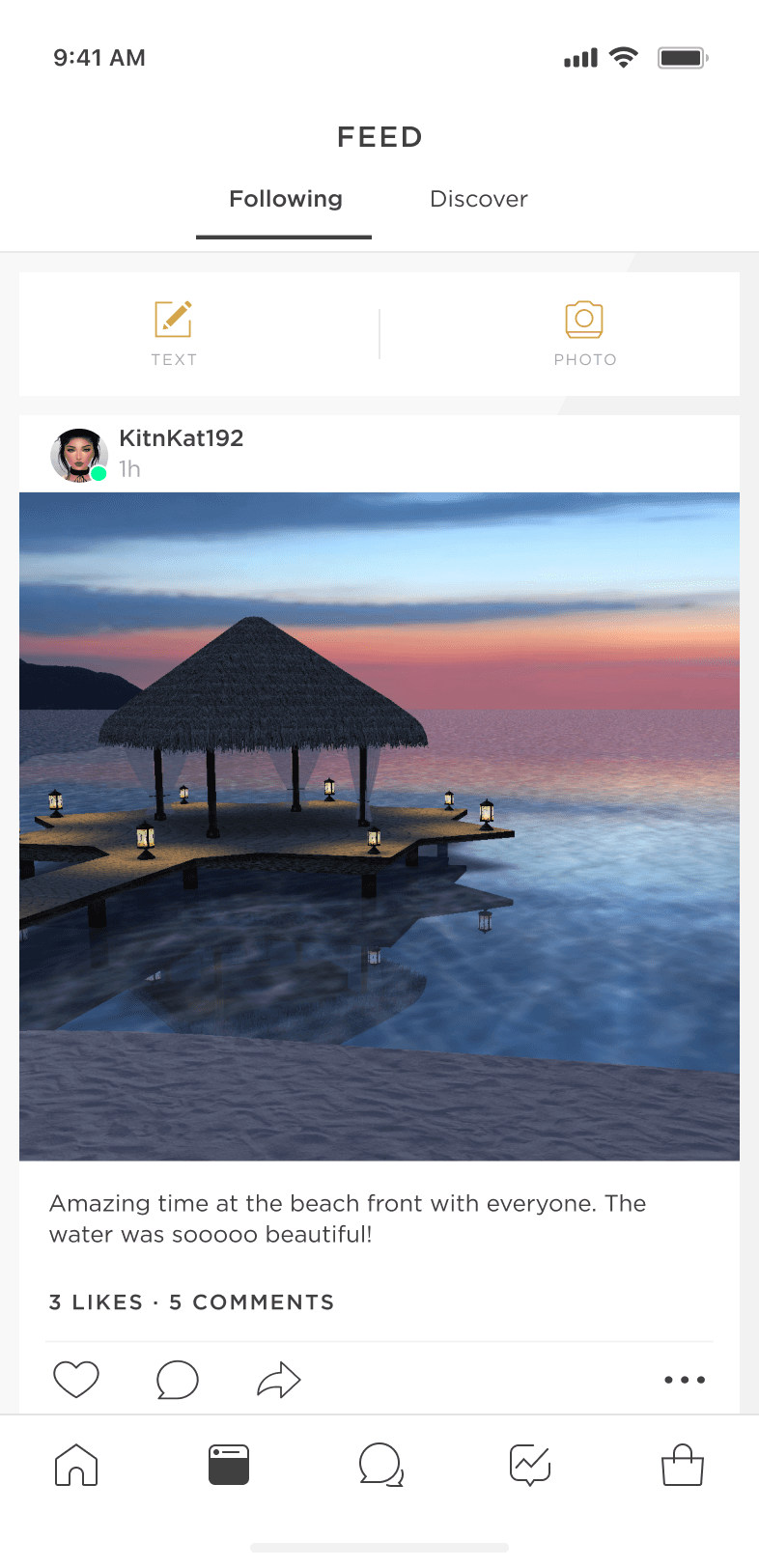
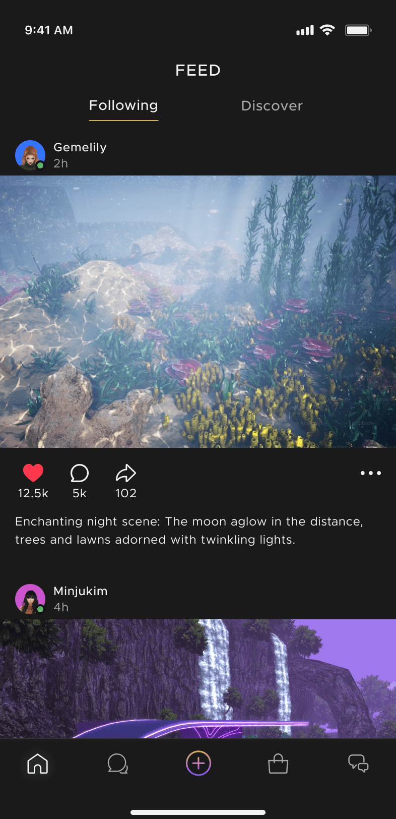
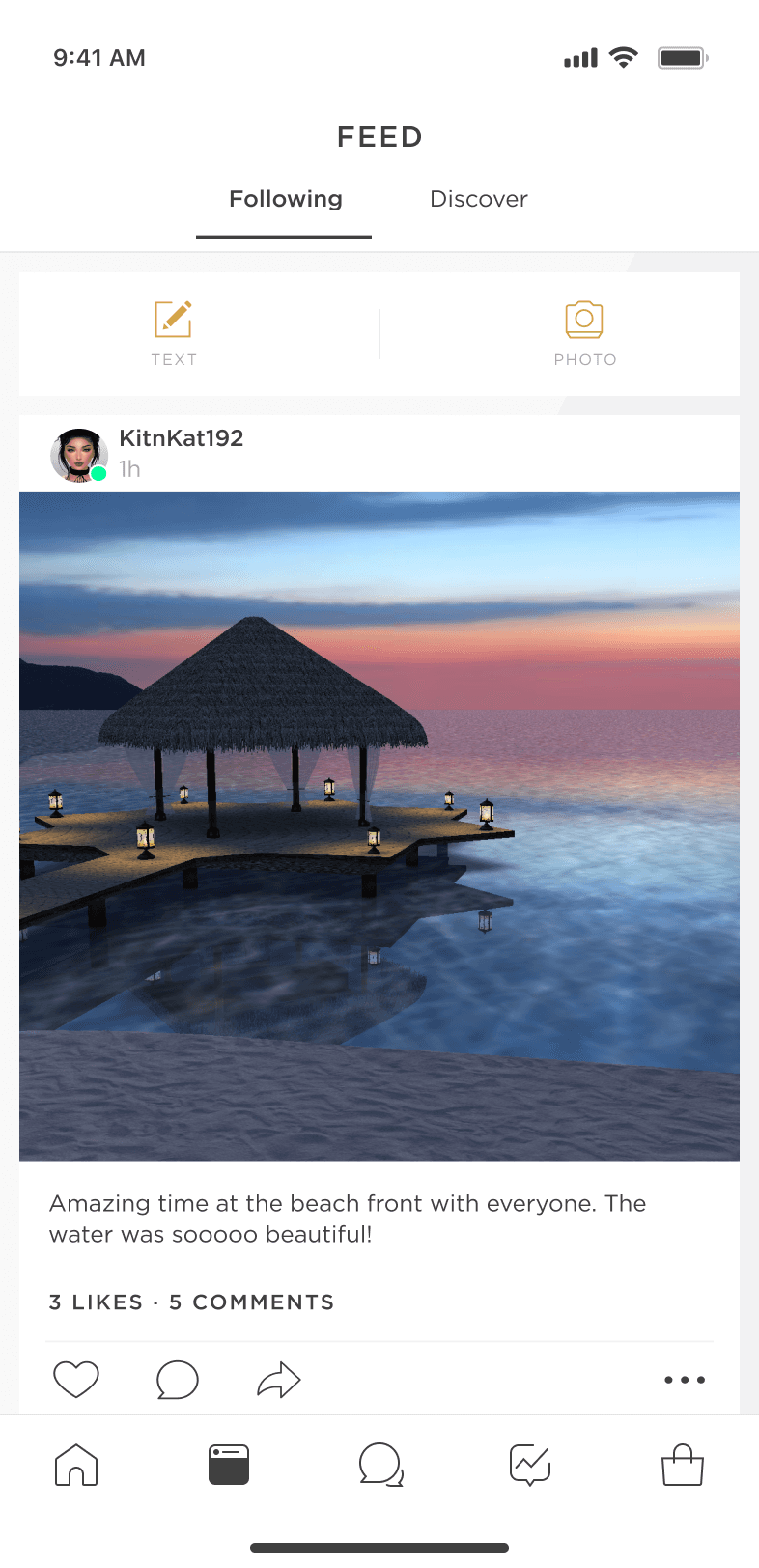
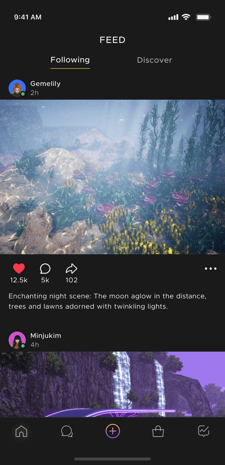
Feed (in progress)
Applying the design system to address legacy code, preparing the Feed to better support social engagement and retention as a core feature and enable users to do more with less action.
Feed (in progress)
Applying the design system to address legacy code, preparing the Feed to better support social engagement and retention as a core feature and enable users to do more with less action.
Before
After
Before
After
Before
After
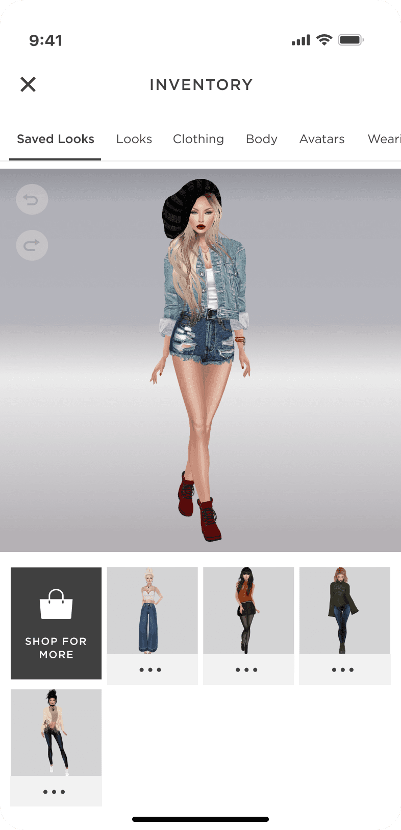
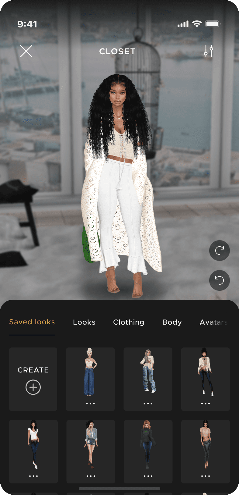
Inventory (in progress)
Organized content for easier access and better chunking as inventory grows. Renamed to “Closet” for a more inclusive, audience-friendly feel.
Inventory (in progress)
Organized content for easier access and better chunking as inventory grows. Renamed to “Closet” for a more inclusive, audience-friendly feel.
Before
After
Before
After
Before
After
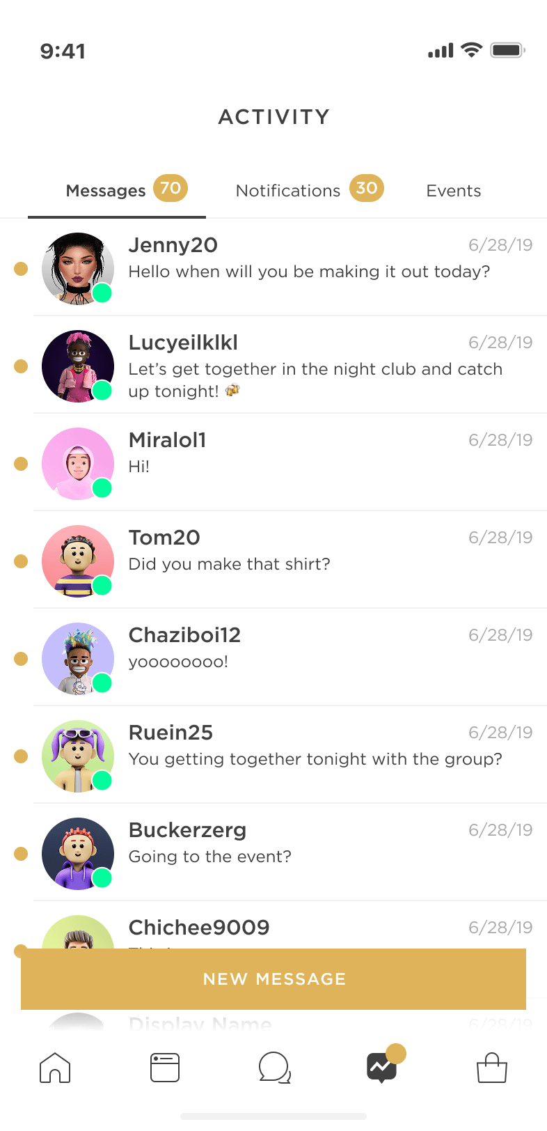
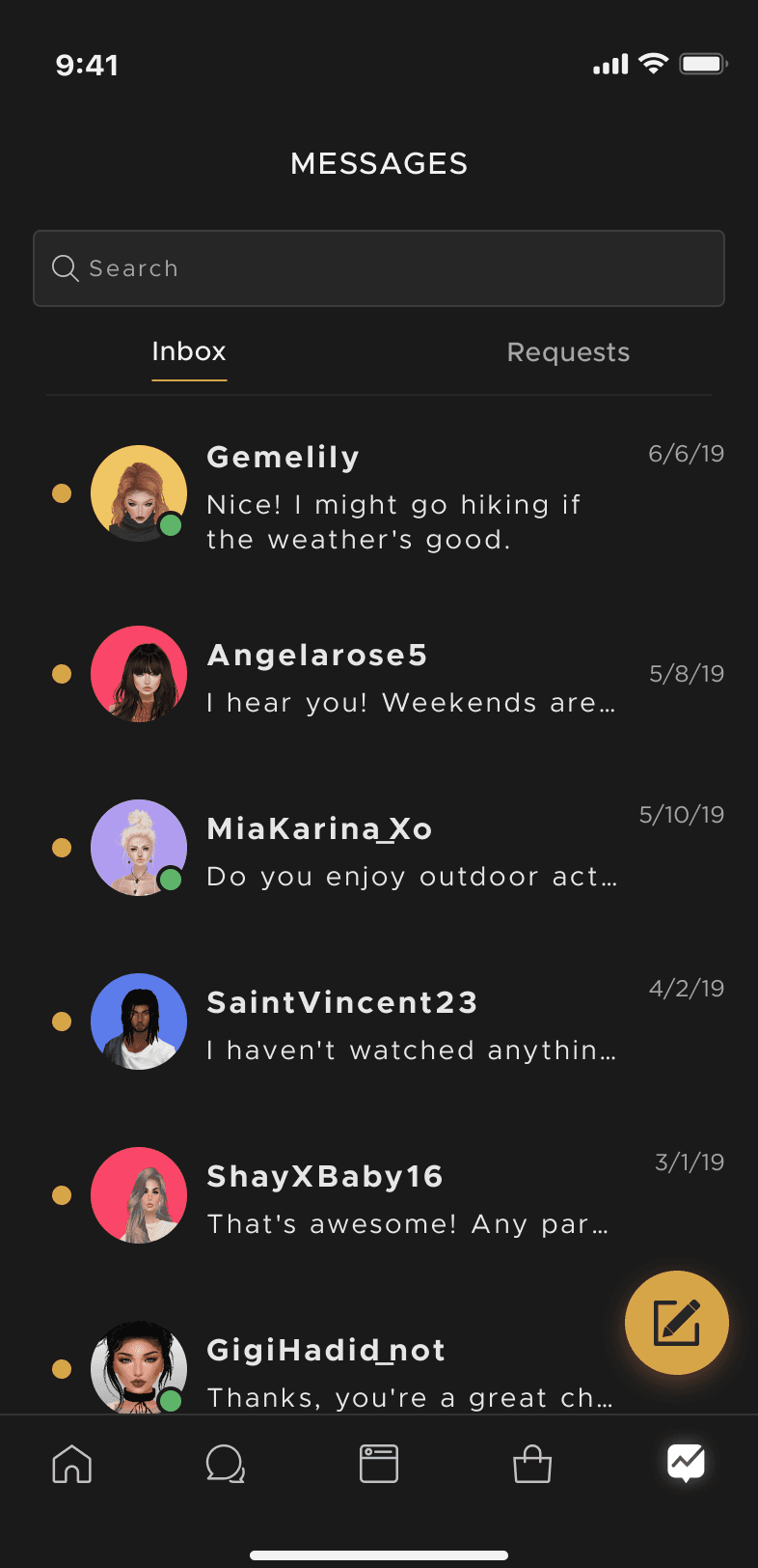
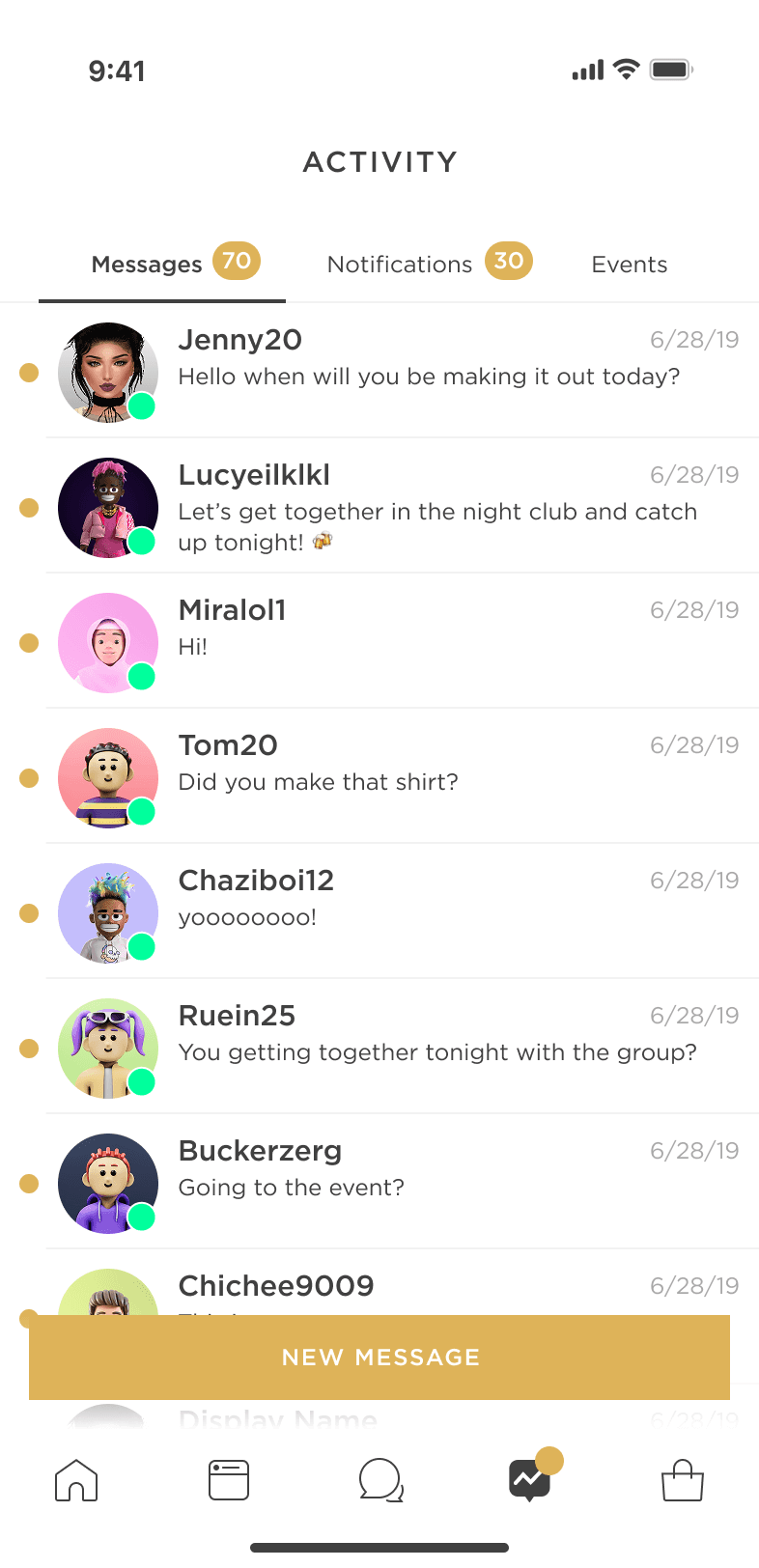
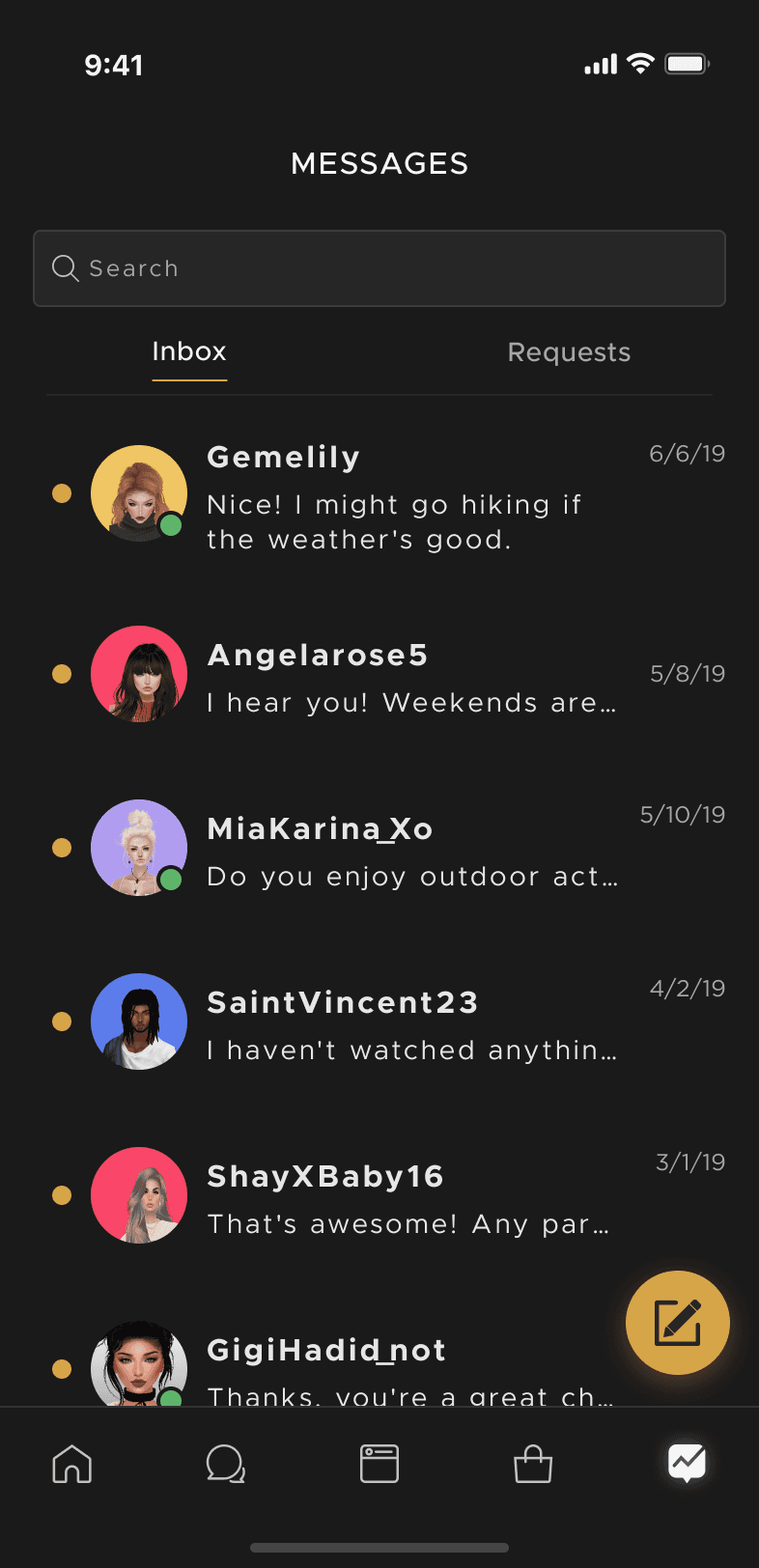
Messages (in progress)
Improved the activity center and inbox by organizing notifications and focusing on seamless two-way communication, making it easier for users to manage messages.
Messages (in progress)
Improved the activity center and inbox by organizing notifications and focusing on seamless two-way communication, making it easier for users to manage messages.
RESULTS
Higher Quality & Quantity
Created a new design language embraced by our community and reduced eng overhead. This required an initial scope increase but didn’t delay releases.
70%
Faster Design
velocity during wireframe to high fidelity and prototypes
25%
less front-end
required to complete UI and in progress feature work
98%
Sentiment
score from internal teams working with new system
10%
more effort
in some feature work due to more investment up front
LEARNINGS
Investment for the Future
Investment for the Future
Redesigning an aging app while keeping feature velocity taught me to lead with vision and pragmatism. A key shift was helping stakeholders see design as a parallel system-building effort.
Redesigning an aging app while keeping feature velocity taught me to lead with vision and pragmatism. A key shift was helping stakeholders see design as a parallel system-building effort.
Taking hands-on initiative had impact
Jumping ahead to create direction and showcase how foundations and components can work helped get feedback and alignment much earlier than waiting.
Understanding engineering infrastructure
Learning engineerings challenges across iOS, Android, and web enabled decisions around design without risk of hitting blockers.
Fostering growth and learning for designers
It was rewarding to see designers thinking beyond quick fixes and leaning into scalable systems—avoiding short-term builds that often lead to overhead and quality issues
Provide investment opp with proof
Showcasing how design systems can speed up feature releases, reduce QA, and enable faster design was key to alignment with all teams.