IMVU Redesign
"Bring clarity, relevance, and modern craft to IMVU — one experience at a time."
"Bring clarity, relevance, and modern craft to IMVU — one experience at a time."

Role
Director, Product Design
Timeline
1 year (including feature work)
Scope
Onboarding Marketplace Design System Retrofitting
Teams
3 Designers Engineering Product Marketing
What & Why
IMVU, a pioneer in the social Metaverse space, had a loyal user base that enabled users to express themselves through avatar and virtual space customization, connect through social chat and interaction, and even allow for users to make a living off the platform through the UGC marketplace. but it's core experience hadn't evolved with modern expectations in over a decade. As engagement and monetization flattened, it became clear that both the product and platform needed to be reimagined—visually, functionally, and systematically.
My goal: "Modernize IMVU without halting progress." I set out to rebuild the design foundation, align with modern product expectations, and improve the experience for both user and business needs.
Goals
To guide both our design direction and cross-functional execution, I aligned the team around four core objectives:
Modernize UI/UX: competitive and intuitive
Support feature pillars: Monetization, Onboarding, and Engagement
Build a design system: scalable, consistent, and efficient
Streamline design reviews: improve quality and delivery pace
Approach
With limited resources and leaner teams, a full app overhaul wasn’t realistic. I proposed a hybrid strategy: align stakeholders across product, engineering, and design around the idea of incremental transformation—modernization through core features.
We focused on these key shifts:
New feature UI was already elevating—the system needed to catch up
Design committed to shipping a cross-platform library within 1 quarter
Work stream were layered into existing product cycles without disruption
Managed onboarding/training across the team
Pillars
Without the bandwidth for a full-scale redesign, we aligned our redesign work to product priorities—Monetization, Engagement, and Onboarding. Each feature track became an opportunity to apply, test, and refine our design system in real-world environments.
A challenge here was designing both the feature and the system it would run on. For example, while creating the new Hashtags feature (centered on content personalization), we also implemented and tested core UI foundations within the feature footprint.
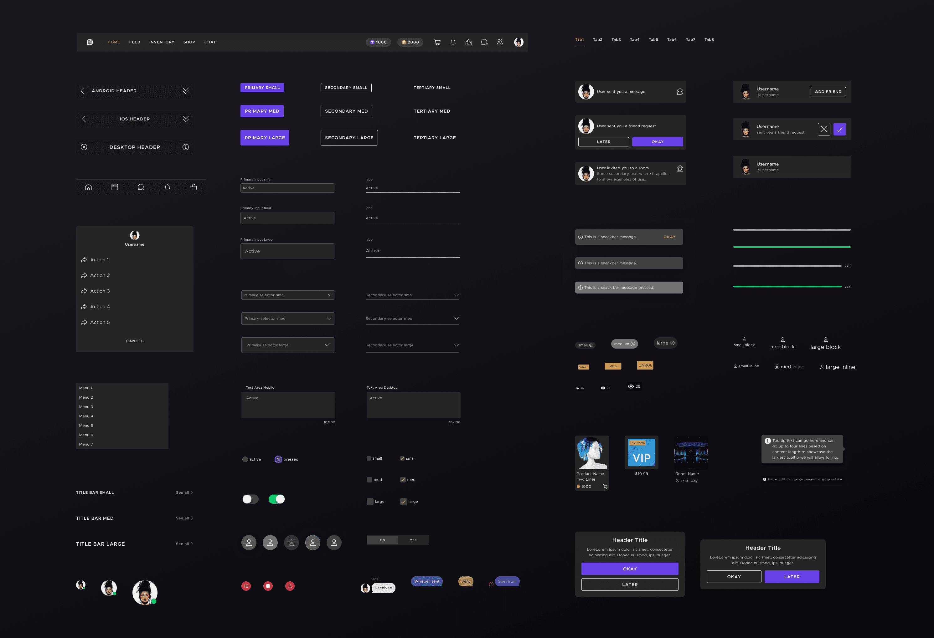
🔸Design System Modernization
To support our vision, I built a scalable design library grounded in modern best practices, drawing from past experience and researching systems used by other lean teams. This required a more hands on take as my current team previously didn't have any leadership or experience with modern systems.
I led:
Creation of core principles
Reimagined color styles, fonts, spacing, and accessibility tweaks
New components and documentation
Management/Training of designers
All updates were reviewed collaboratively with Design, Product, and Engineering. One key decision was to deprecate separate light/dark themes in favor of a single, optimized mode—cutting down on engineering, QA, and design overhead significantly.
🔸Engagement & Monetization
This pillar aimed to both modernize visual design and move key KPIs. Each feature leveraged the new system to ensure consistency and developer velocity.
1. Marketplace Redesign
New categories, layouts, and UI flow and driving revenue by improving discoverability, leading to credit spend.
2. Hashtags
Introduced preference based content surfacing to boost relevance, driving higher engagement and time spent in chat and profile experiences.
3. Daily Rewards
Ads-driven feature that targeted non-spenders—using new design treatments to boost engagement, generate ad revenue, and convert users to VIP subscriptions.
🔸Onboarding
After digging into our FTUX data, we uncovered critical drop-offs:
70% at avatar selection
30% at registration
Users who join a room on Day 1 were 50% more likely to retain 1 month+
This led to a focused redesign of early user flows, emphasizing:
Fewer barriers to first entry
Simpler, cleaner avatar selection
A more digestible dashboard for new users
I pitched this approach directly to our CEO and product leadership—marking a turning point in how design was seen as a strategic partner, not just a service function.
Though I left before it shipped, I left behind a clear and comprehensive vision for the team to carry forward that was approved by the CEO and board as a top priority going into 2025 through 2026.
Outcome
Below are data points gathered from internal feedback, product data, and our community channels with users.
Below are data points gathered from internal feedback, product data, and our community channels with users.
Below are data points gathered from internal feedback, product data, and our community channels with users.
🔸Design Structure
By Q1 2024, our core design library was live across platforms—backed by documentation, tokens, and new Figma practices.
Despite building the system in parallel with features, the team sustained strong delivery:
70% faster design velocity (wireframe to high-fidelity)
25% improvement in initial front end implementation
98% internal sentiment score for visual and functional quality\
These achievements made me extremely proud of the team as we were so lean at one point design was deemed the high risk of becoming a blocker based on the feature demand from the board. Based on a lot of the execution and support I was even able to promote two of my employees.
🔸Impact by Area
Hashtags
First feature fully powered by the new design system
Drove deeper engagement in search, chat, and profiles
Marketplace
+8% in marketplace revenue from improved layout and product surfacing
Ad Rewards
+15% in ad revenue, with some users converting to VIP subscriptions
Onboarding (in-progress)
Strategy and structure handed off to team with long-term rollout plans
Created a foundation for personalized, lower-friction first-time flows
🔸User Sentiment
85% user approval from Discord surveys and feedback threads
Most common themes: “More modern,” “finally elevating,” and “it's been so long since any change!”
While feature-specific data was complex to isolate, teams noted that UI/UX clarity played a major role in improving adoption, not just feature mechanics.
Learnings & Reflection
Redesigning an aging app while maintaining feature velocity taught me how to lead with both vision and pragmatism. One of the most meaningful shifts was showing stakeholders how design could guide product thinking, not just react to it.
I’m proud of how the team pushed forward on product ideas, challenged assumptions, and applied the system thoughtfully rather than mechanically. That mindset helped us tie modernization directly to engagement and monetization – through great experiences, not just new features.
"The secret of change is to focus all of your energy not on fighting the old, but on building the new."
-Socrates
"The secret of change is to focus all of your energy not on fighting the old, but on building the new."
-Socrates